Oil companies once ruled the globe, because they had control of an immense, untapped valuable asset – oil. It was so valuable that it was known as ‘Black Gold’. Now Data is the ‘New Oil’: the black gold of the 21st century. All businesses have lots of Data, but, in itself, Data is merely facts and figures. Just as oil needs to be refined and processed to be useful, Data needs to be analysed.
Data analysis is the process of inspecting, cleansing and transforming Data, so that it can be structured and presented as useful information, informing conclusions, and supporting decision-making. Data is, in fact, fundamentally changing the world we live in and analysing Data to find is now a key skill in many job roles.
Excel is designed specifically for Data analysis. It can connect to a wide range of Data sources, clean and transform Data automatically, and create incredible visualizations to show trends, and create reports. Infero’s new 3-day Data Analysis and Visualization with Microsoft Excel course covers all of Excel’s extensive Data analysis capabilities.
Data Analysis and Visualization with Microsoft Excel
Delivery Method – Instructor-led, group-paced, online or classroom-delivery learning model with structured hands-on activities.
Target Students – Business professionals who want to learn how to perform advanced Data and statistical analysis with Microsoft Excel using PivotTables; be able to use tools such as Power Pivot and the Data Analysis ToolPak to analyse Data, and learn how to visualize Data in charts and dashboards in Excel.
Prerequisites – Before taking this course, students are recommended to have taken the Microsoft Excel Introduction course, or have equivalent knowledge:
Course Objectives
Upon successful completion of this course, students will be able to analyse and visualize Data using Microsoft Excel and associated tools. You will:
- Perform Data analysis fundamentals.
- Visualize Data with Excel.
- Analyse Data with formulas and functions.
- Analyse Data with PivotTables.
- Present visual insights with dashboards in Excel.
- Create geospatial visualization with Excel.
- Perform statistical analysis.
- Get and transform Data.
- Model and analyse Data with Power Pivot.
- Present insights with reports.
Course Content
DAY 1
Lesson 1: Data Analysis Fundamentals
Topic A: Introduction to Data Science
Topic B: Create and Modify Tables
Topic C: Sort and Filter Data
Lesson 2: Visualizing Data with Excel
Topic A: Visualize Data with Charts
Topic B: Modify and Format Charts
Lesson 3: Analysing Data with Formulas and Functions
Topic A: Analyse Data with Formulas and Named Ranges
Topic B: Analyse Data with Functions
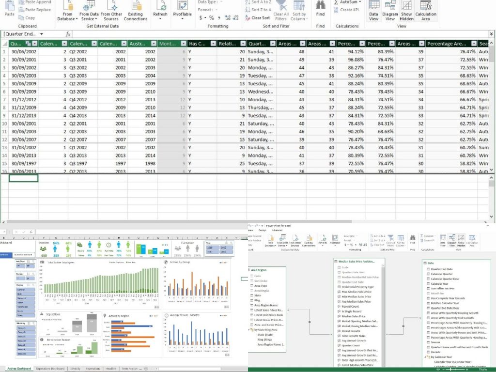
Lesson 4: Analysing Data with PivotTables
Topic A: Create a PivotTable
Topic B: Analyse PivotTable Data
Lesson 5: Presenting Visual Insights with Dashboards in Excel
Topic A: Visualize Data with PivotCharts
Topic B: Filter Data Using Slicers and Timelines
Topic C: Create a Dashboard in Excel
DAY 2
Lesson 6: Automating Data Analysis
Topic A: Implement Data Validation, Forms, and Controls
Topic B: Adding Form Controls to a Worksheet
Topic C: Create Conditional Visualizations with Lookup Functions
Lesson 7: Creating Geospatial Visualizations with Excel
Topic A: Create Map Charts in Excel
Topic B: Customize Map Charts in Excel
Lesson 8: Performing Statistical Analysis
Topic A: Visualize Trendlines and Sparklines with Excel
Topic B: Analyse Data with the Data Analysis ToolPak
Topic C: Apply Best Practices in Chart Design
DAY 3
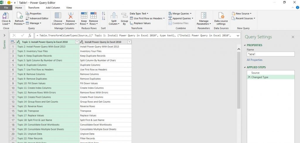
Lesson 9: Getting and Transforming Data
Topic A: Connect to Data with Queries
Topic B: Clean and Combine Data
Topic C: Shape and Transform Data
Lesson 10: Modelling Data with Power Pivot
Topic A: Install Power Pivot in Excel
Topic B: Create Data Models with Power Pivot
Topic C: Create Power Pivots
Lesson 11: Analysing Data with Power Pivot
Topic A: Data Analysis Expressions (DAX)
Topic B: Perform Advanced Data Analysis and Visualization with DAX
Topic C: Creating a Key Performance Indicator (KPI)
Topic D: Working with Dates and Times in PowerPivot
Lesson 12: Presenting Insights with Reports
Topic A: Plan a Report
Topic B: Create a Report
0 Responses to “Data Analysis and Visualization with Microsoft Excel”
Leave a Reply